
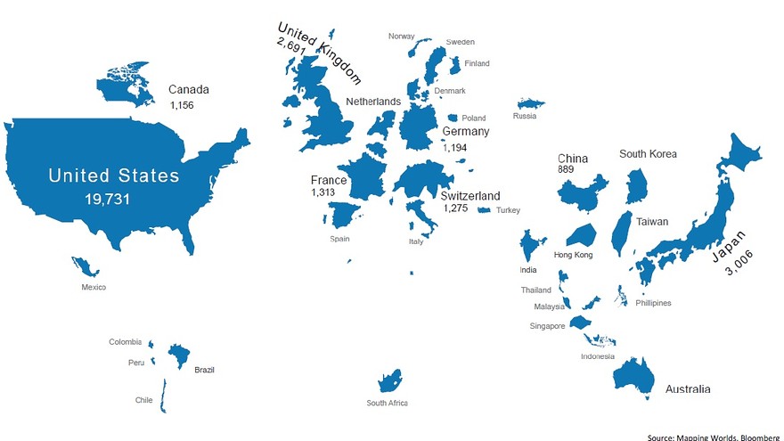
Bank of America Merrill Lynch this month published a report transforming many of their investment themes into maps.
One of note is what the world would look like if sized by market capitalization.
The U.S. is still looking like the U.S. — and Japan is pretty hefty — but where did China go? And how is Hong Kong bigger than the mainland?
